Why accountants should treat their website like an ecommerce store
There is a useful exercise for any accountant or professional services firm thinking about their website. Open the site of a printer, a bedding retailer, a wine merchant, or any half-decent ecommerce operator. Watch what happens between the moment the visitor lands and the moment they hand over money.
The site shows the product. It shows the price. It pre-empts objections in the copy. It puts trust signals in the visitor’s eye line. It splits the call to action by intent, so the ready buyer and the not-yet buyer both have somewhere to go. It captures the email of anyone who leaves without converting, so the next round of contact is warm.
Now look at the average accountancy website. A homepage of capability bullets, a generic “Contact Us” form sitting alone at the end of every page, and almost nothing in between to handle the questions a real buyer is silently asking before they fill it in.
Accountancy enquiries in 2026 do not behave like accountancy enquiries in 2010. They behave like ecommerce. The firm whose website understands that wins enquiries the rest of the market does not even know it is missing.
The buying process has already moved online
Most of the work that decides whether you get the enquiry is now done before the enquiry is made.
The business owner who is thinking about switching accountants does not phone three firms. They Google. They read sector content. They scan service pages. They scroll a team page to see if the firm looks like the kind of place they would actually want to deal with. They check pricing if it is shown, and assume the worst if it is not. They form a shortlist of one or two firms, and only then do they fill in the form.
By the time the enquiry hits your inbox, the visitor has already qualified you, compared you, decided what they think of you, and chosen to either lean in or move on. The website is not the start of the buying conversation. It is most of it.
This is the same shape as ecommerce. The shopping decision happens long before the checkout button is clicked. The job of the site is to remove every reason not to click.
Three jobs your homepage has to do before the enquiry button works
A serious ecommerce site does three things to a visitor before asking for the conversion. Trust the operator. Understand what is being offered. Have their main objection handled. Accountancy buyers need exactly the same three things, and most accountancy websites do none of them.
Trust
Trust on a print-on-demand site is built with reviews, guarantees, secure-checkout badges, real product photography, and visible team contact. Trust on an accountancy site is built with the same set of moves, translated into the category. Years in practice, number of clients served, regulatory status, named partners with faces, real client examples, and a tone of voice that sounds like a person, not a brochure.
Logos of clients you have served. Real testimonials with full names and businesses, not initials. The number of businesses on the books. The sectors you genuinely know. A photographed team, not a stock photo. Each of these signals is small. Stacked together, they are the difference between a site that earns the next click and a site the visitor closes.
Understanding
Ecommerce sites teach the visitor what they are buying before they are asked to buy. Stocks, finishes, weights, sizes, use cases. The visitor finishes the page knowing more than they did when they landed.
Most accountancy sites do the opposite. They list services as one-word categories (“Tax”, “Audit”, “Payroll”) and assume the visitor knows the rest. The serious buyer wants to read about their actual situation. They run a hospitality business. They have hit the VAT threshold. They have a Making Tax Digital deadline they are not sure how to meet. They do not want to read about “tax services”. They want to read about their problem in their own language, with their own vocabulary, and recognise themselves in the page.
A sector hub for hospitality that talks about tronc, mixed-rate VAT, and weekly site P&L is doing what an ecommerce product page does. It teaches the visitor enough to feel they are in the right place, in the right hands, with someone who understands what they actually need.
Objection handling
The single biggest commercial gap on accountancy websites is unhandled objection. The visitor has questions, and the site does not answer them.
Will this be expensive? How does switching actually work? Will my current accountant be difficult about it? How long does onboarding take? Will I have to do things differently? Will I be talking to a partner or a junior? What software do they support? What happens if I have a problem in the middle of year-end?
Every one of these is a sale-blocker. Every one of these is something an ecommerce checkout pre-empts as a matter of course. Returns policy. Delivery times. Sizing guide. Compatibility. Support contact. The buyer never has to wonder, because the site has already answered.
A switching-accountants page that walks through the process step by step. A pricing band that shows what an engagement actually costs. A timeline that says how long onboarding takes. An FAQ block on every service page that answers the specific question the buyer is sitting with. None of this is bold. All of it removes friction. Removed friction equals more enquiries.
The CRO mechanics ecommerce takes for granted
Beyond the three jobs, ecommerce sites use a set of conversion mechanics that accountancy sites mostly ignore. Each of them is straightforward to apply.
Split the call to action by intent. Ecommerce splits “Add to basket” from “Add to wishlist”, or “Buy now” from “Save for later”. Accountancy can do the same. “Book a discovery call” for the high-intent visitor who is ready for a diary entry. “Get a callback” for the visitor who wants a conversation but does not want to choose a slot. The single “Contact Us” button forces every visitor through the same gate, and most do not walk through it.
Show pricing where you can. A starter band, an indicative range, a “from £X per month for typical owner-managed businesses” line. Ecommerce shows price because hiding it loses the sale. The same is true in services. A buyer who cannot tell whether you are in their budget will assume you are not.
Capture the not-yet buyer. Ecommerce captures email at every opportunity. Discount codes, basket recovery, restock alerts, newsletters. Accountancy can do the same with a sector guide, an MTD checklist, a year-end timeline. The visitor who is not ready to enquire today is not lost. They are an email subscriber the firm warms over the next six months.
Make the path obvious. The visitor should never have to think about where to go next. From homepage to sector page to service page to enquiry. From article to author bio to service page to enquiry. Each step pulls the visitor one click closer to the conversion. A site that asks the visitor to navigate from scratch is a site that loses them.
Speed and clarity over decoration. Ecommerce sites are fast because slow loses sales. Accountancy sites tend to be slow because the platform was chosen for the back office, not the visitor. Page speed is conversion speed. Move it up the priority list.
What this looks like in practice
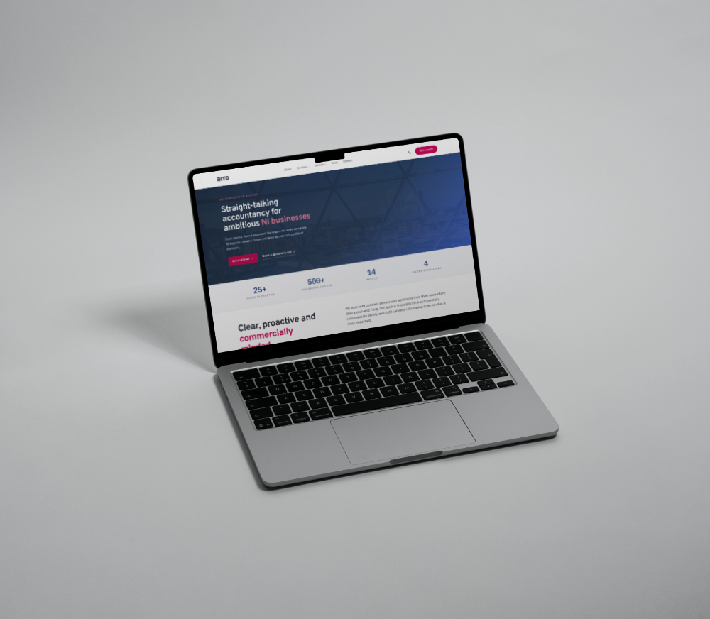
We rebuilt Arro Accountants as exactly this kind of site. A Belfast chartered firm with twenty-five years in practice and over five hundred clients on the books, but a website that ranked for almost nothing and converted almost no one.
The rebuild was structured around the three jobs. Trust was built through stat bars, sector specialism, named partners, and real client signal. Understanding was built through five sector hubs covering hospitality, retail, construction, manufacturing, and not-for-profit, each in the language the buyer uses themselves. Objection handling was built through a dedicated switching-accountants page, transparent pricing bands, FAQ blocks at the bottom of every service page, and clear answers to the questions buyers actually carry.
CRO mechanics sit on top. A discovery call CTA for high intent. A callback CTA for low intent. A lead magnet for visitors who are not ready for either. A national Making Tax Digital content cluster routing informational searchers into Belfast-specific service pages. The site is built on a fast, owned static stack that compounds in value rather than depreciating.
The blueprint came from the ecommerce side of the studio. We had just finished launching Papercut Printers, an actual print ecommerce build with live product configuration, live pricing, transparent guarantees, and full pre-press flow. The mechanics that sell a £200 print order are the same mechanics that close an accountancy engagement worth a hundred times that amount. The visitor wants to trust the operator, understand the offer, and have their main objection handled before they hand anything over. The category does not change the rules.
The new baseline for professional services
The accountants who are still treating their websites as digital business cards will continue to win on referral and lose everywhere else. The ones who are treating their websites like a checkout will win the search traffic, the inbound enquiries, and increasingly the high-quality clients who shopped around before deciding.
The mechanics are not new. Ecommerce has been operating this way for a decade. The shift is that accountancy buyers now behave the same way as everyone else online, and have done since well before MTD made search demand even louder. The firms that meet them on those terms compound. The firms that do not, do not.
If your website is not handling trust, understanding, and objection before the enquiry, the enquiry is happening at a competitor.