Brand identity and ecommerce launch for a modern Belfast print house
Commercial print is a crowded, price-led category dominated by national online printers and legacy local trade shops. Papercut needed to launch into that market with a brand that felt unmistakably modern, a story rooted in Belfast, and an ecommerce experience that could compete with the convenience of the nationals while protecting the trust and craft of a local printer.
A complete brand identity system paired with a configurator-led ecommerce site. Restrained, contemporary visual design carries the brand. Live product configuration, transparent pricing, and a reprint guarantee carry the commercial proposition.
20+
Product lines configured
Live
Pricing on every product
2 day
Express turnaround live
Challenges and opportunities
Commercial print has been hollowed out by national online printers competing almost entirely on price. Local trade shops still hold relationships and quality, but most look and feel like they were built for a different decade. The space in the middle, modern, local, transparent, easy to buy from, was largely empty in Belfast.
Papercut launched into that gap. The brand had to do two things at once. It had to feel as polished and easy to buy from as the largest national sites. And it had to make the case for “Belfast Made” without leaning on tired local-trade visual cues.
Brand positioning
We started with the positioning. Papercut is not the cheapest printer in the UK and was never going to be. The proposition is quality print, made in Belfast, with a team you can actually speak to, backed by guarantees that the nationals will not match.
That gave us the platform line: “Quality Print, Belfast Made.” Plain, confident, and useful in marketing without needing translation. From there the messaging architecture worked outwards into product-level promises: free pre-press artwork check, free tracked Northern Ireland delivery, free reprint on every order, all-inclusive pricing.
Brand identity
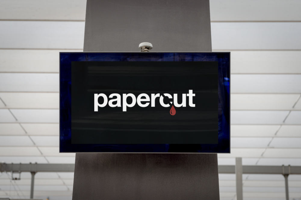
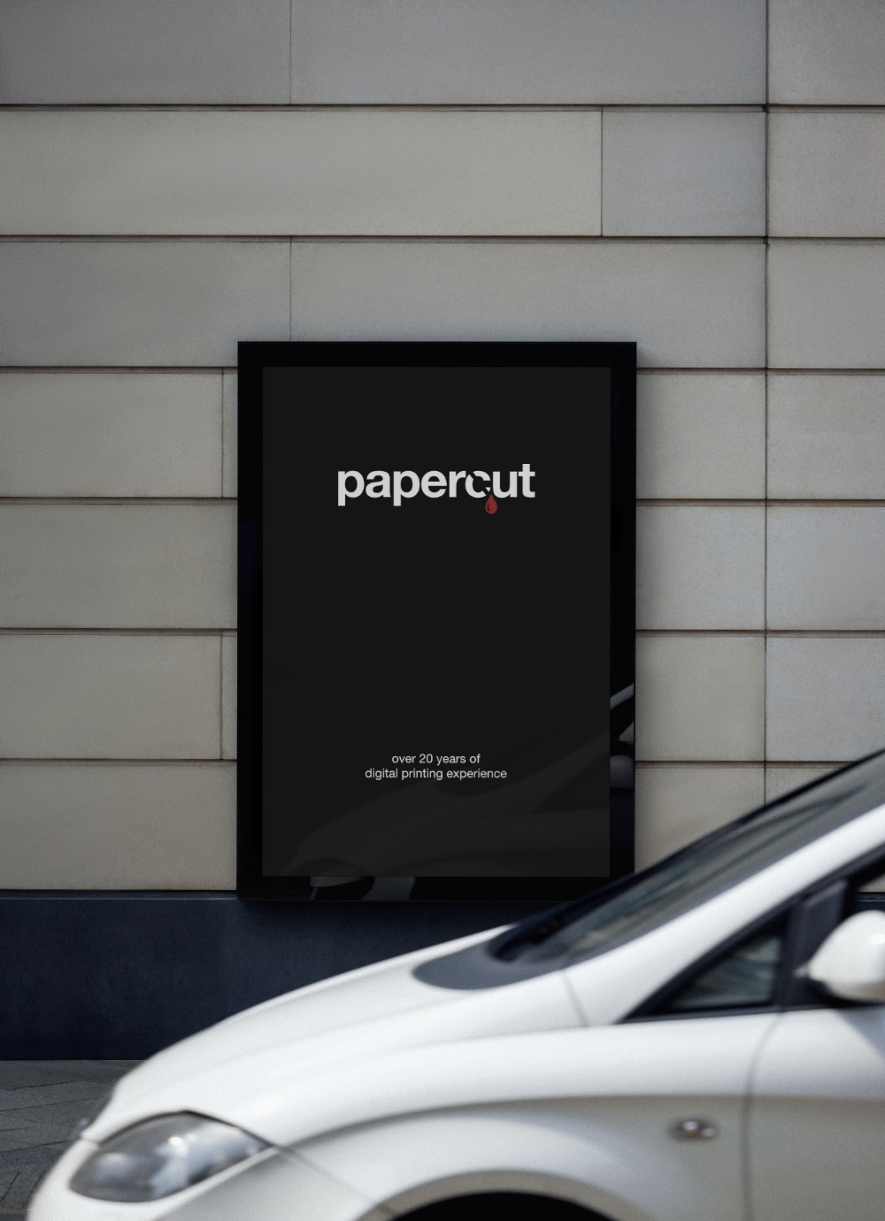
The identity is built around a single, confident wordmark. Lowercase “papercut” set in a bold, slightly rounded sans-serif, paired with a small red drop sitting against the letterforms. The drop is a literal play on the name, the sharp edge of paper that draws blood, and gives the brand a memorable mark without forcing a logomark to do work the wordmark already handles.
The palette is black, white, and a single red accent. Disciplined, graphic, and unmistakable in any environment, from a backlit shopfront sign to a product card on a search results page. Print is a category that lives or dies on contrast and crispness, and the identity leans into that rather than apologising for it.
Photography focuses on finished product samples in real lighting, with the brand sitting quietly behind the work. Stocks, finishes, and folds carry their own visual interest, so the photographic style stayed restrained and consistent. The guidelines were written to keep that discipline in place as the brand extends into signage, social, paid, and packaging.
Tone of voice
The tone is plain-spoken and confident. No design-industry jargon, no slogans dressed up as values. Where the nationals lean on noise, Papercut leans on guarantees. The copy explains technical terms inline, treats the customer as capable, and lets the proposition do the selling.
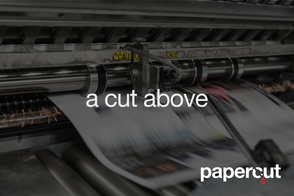
Launch creative leans into the same idea. “A cut above” sits over a press in motion: kit, craft, and a wink at the wordmark. Confident, direct, and unmistakably Papercut.
Ecommerce design and development
The site was designed as a commercial tool. Every product page is a configurator: stock, lamination, format, finish, single or double sided, quantity, and turnaround. Pricing updates live as the customer makes choices, and volume discounts apply automatically. There is no quote form on standard products. Customers see the price, see the options, and order.
The catalogue covers the full commercial print range, from business cards and flyers through to brochures, books, exhibition stands, point of sale, rigid media, and outdoor signage. The information architecture was built to scale as new products are added without forcing the navigation to grow with it.
A consultative layer sits inside the product pages. Use-case guidance maps real business scenarios, premium services, conference handouts, hospitality, to recommended stock and finish with the reasoning explained. The configurator handles transactional buyers. The guidance layer handles first-time buyers who do not yet know what they need.
Pre-press and operations
Print orders fail at the artwork stage more often than at the press. We built the pre-press flow into the buying experience. Every order receives a free artwork check before it goes to print. Artwork guidelines are published on the site so customers can prepare files correctly the first time. The reprint guarantee sits behind the whole flow as the final safety net.
This is the part of the experience the nationals strip out to keep prices down. For Papercut, it is the proposition.
SEO and performance
The site was built for speed and search from day one. Technical SEO was implemented at build, the catalogue is structured for product and category indexing, and page performance was optimised for both desktop and mobile commerce. The blog and FAQ content provide ongoing surface area for long-tail search around stocks, finishes, and print specifications.
Results
Papercut launched with a brand and ecommerce platform that holds its own against the national printers on convenience and pricing transparency, while making the local proposition unmistakable. The configurator removes friction from repeat orders. The guarantees remove risk from first orders. The brand carries both without needing to shout.
The platform is built to scale. New product lines, new finishes, and seasonal ranges can be added without redesigning the experience around them.